A client of mine is a recent graduate in Computer Science and he asked if I could create a portfolio for him to showcase his work . I happily accepted since this was a good opportunity to create a very forward thinking web design.
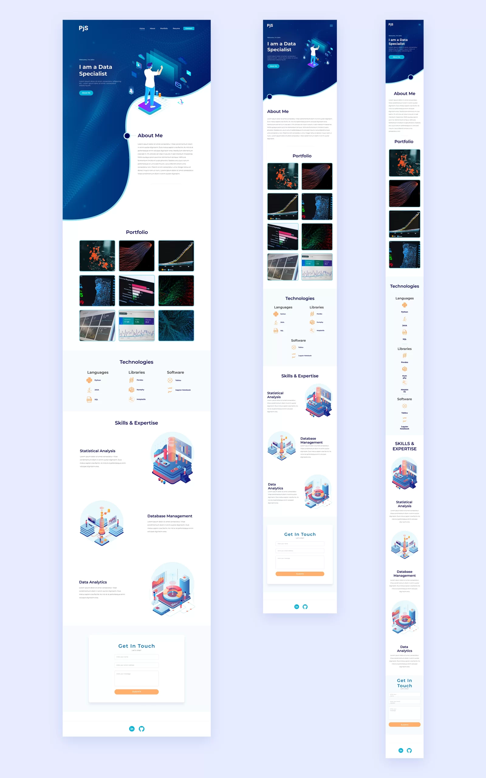
I first researched different Data Specialist portfolios to find a common trend among them in terms of page layout and sitemap architecture. It was a pretty simple scheme: Home, About, Portfolio, Skills, and Contact. I decided to keep this portfolio nice and simple and make it a single page site.
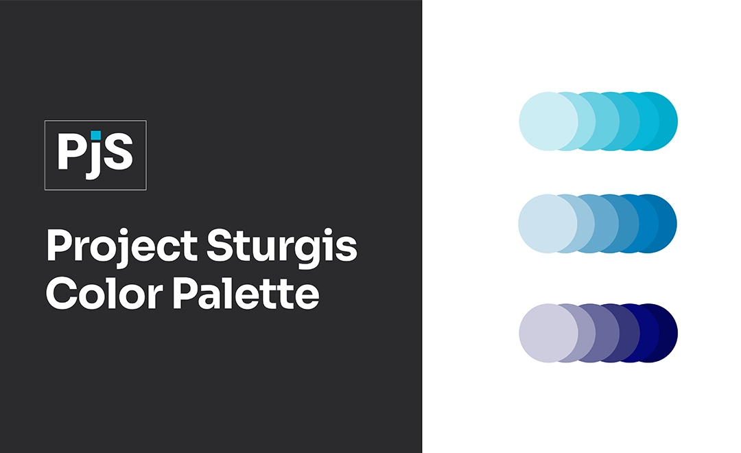
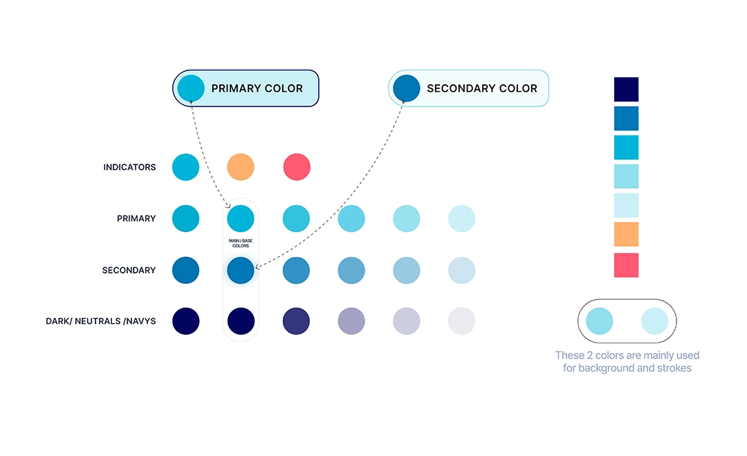
I then created a color palette based on the clients request to have ‘blue’ as the main color. I experimented with different palette arrangements but eventually settled on the perfect one as shown below.
I began designing different layouts in Figma and created a few options that I wanted to have peer reviewed by different designers before moving forward. The initial feedback from all designers had a similar theme: While the layout were that of a “standard” site, they looked TOO much like a standard website. One designer even noted that the layouts look like a well designed resume as a opposed to a website. The feedback that stuck with me the most was that I designed the initial versions to match the style of the portfolios that I studied, but I should instead design a website that will stand out among those portfolios.
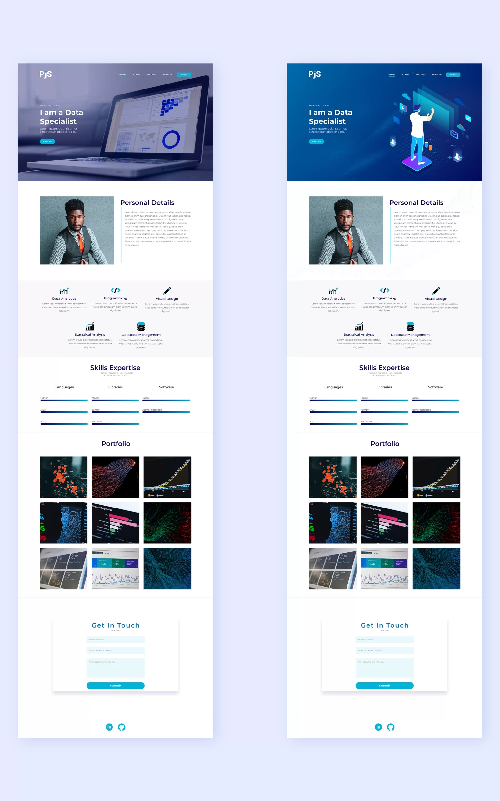
I then went back to the drawing board and researched how different designers approached designing website sections. I wanted to go a different approach outside of the traditional “boxy” sections.
That’s when I came across this design on Dribbble. This talented designer made a concept for a cloud service site and the hero section was designed in the shape of an abstract cloud. I took great influence from this and decided to go down that same route. But I needed to pin point an ‘artifact’ in the data industry to try to convert into an abstract/vector for the hero section. Ultimately I chose the silhouette of an area chart as it is synonymous with data analytics and its profile would be the perfect shape to use as a section shape. From there, I began adding vector art into the design in the vein of this new abstract intro section.

After a final design was created, and approved by my client, I began developing the design in WordPress. I decided to use the Breakdance page builder as it has less bloat, extensive design library, and for its ease of workflow allowing a developer to build in a very short amount of time.

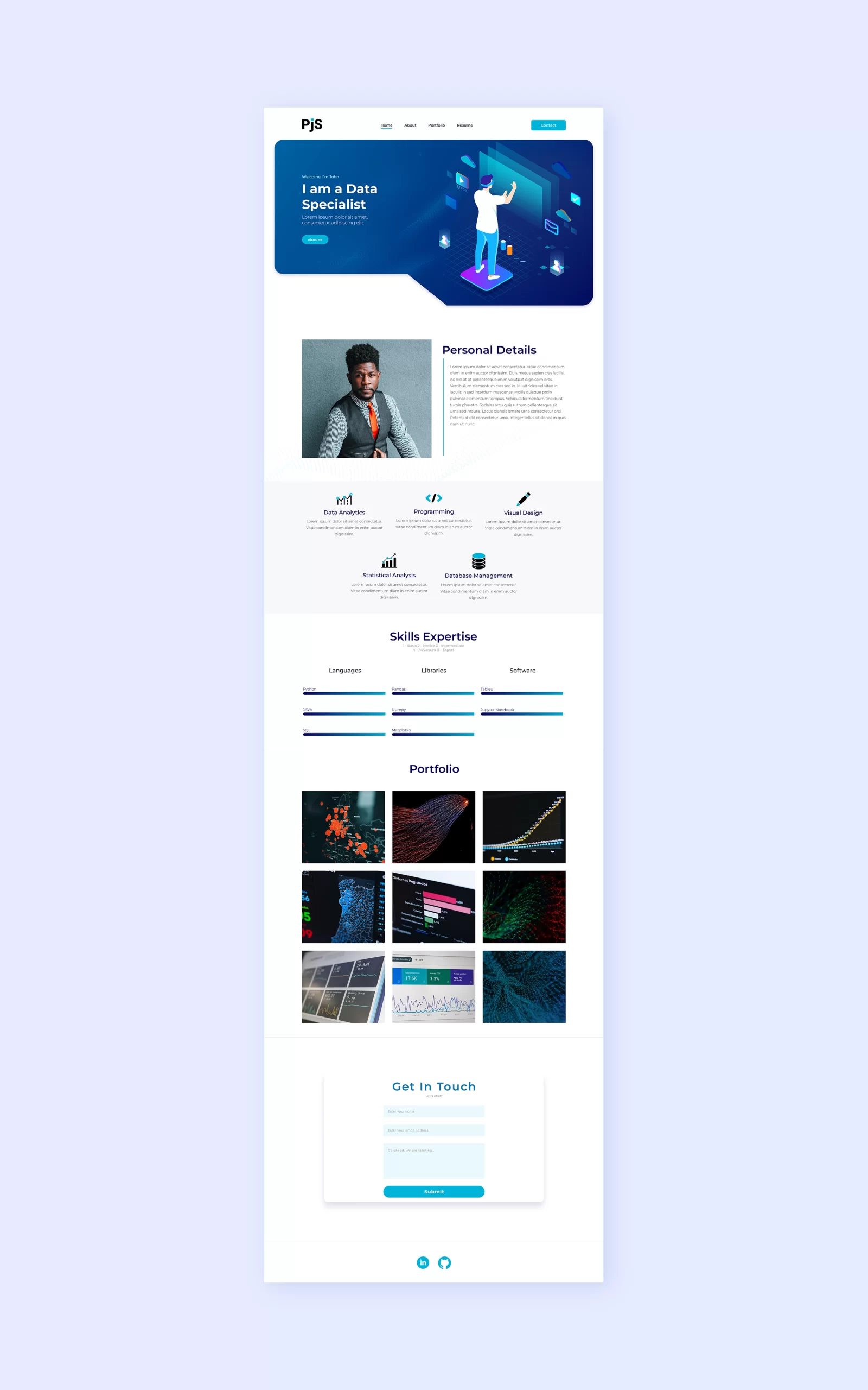
Ultimately this resulted in a clean and beautiful portfolio webpage fit for a Data Specialist!