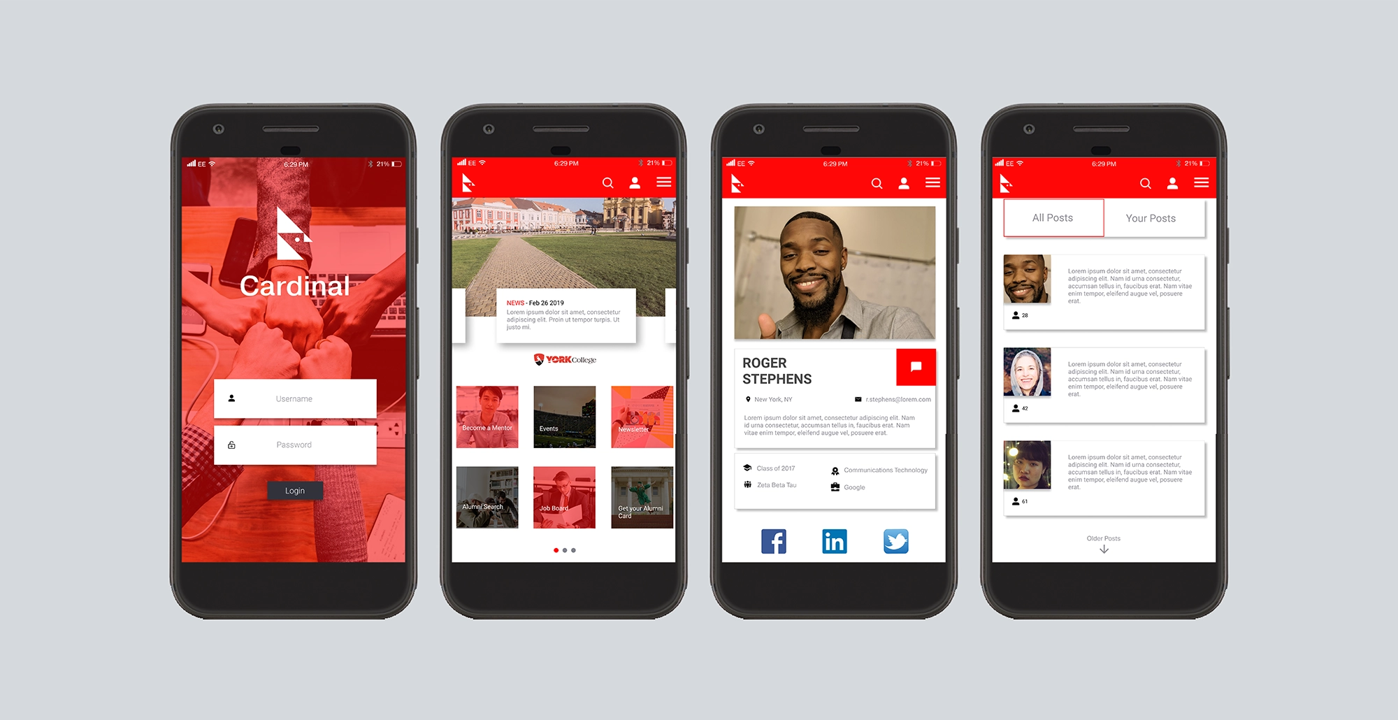
Branding, Design, User Interface.
This project was an assessment challenge during the later phases of the hiring process for IBM (International Business Machine). The project was so well received by the IBM design teams that the company invited me for two day networking event and in-person interview in Chicago. All expenses (including hotel and flight) were covered by IBM. During the second day, I had two one-on-one interviews, participated in various activities including a Creative UX Workshop, and finally presenting my portfolio to the heads of the IBM design teams in the United States.
The assessment was to design a high fidelity app UI for college alumni. The school in this scenario was CUNY, York College, my alma mater. I did extensive research on how mobile applications catered to alumni were typically designed and what features and services they provided. Afterword’s I began to design. I made sure to utilize the brand colors of York College as if Cardinal were a companion app of the actual college website. One thing to note is that the name “Cardinal” is from the school’s mascot. I thought that would be a fitting name for an “app” related to York College’s alumni as it has great meaning to many of it’s students.
Along side the design phase I also conducted research on common statistics found among alumni. Typically this was done with users in the millennial generation concerning their reception towards alumni programs and memberships. Finally, I added this data into a pitch deck which best illustrates the problem posed by the college, the solution I bring (Cardinal), my reasoning, and the advantages of this solution. You can download the deck via the links below:
DOWNLOAD


