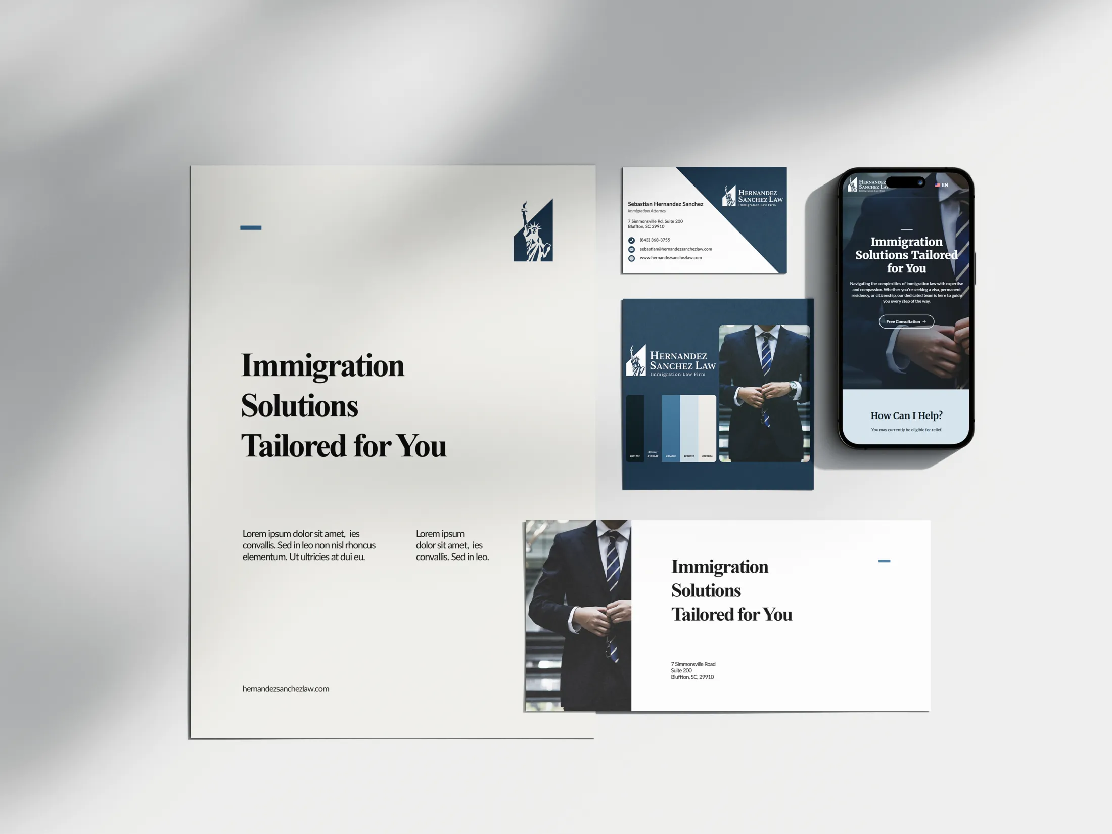
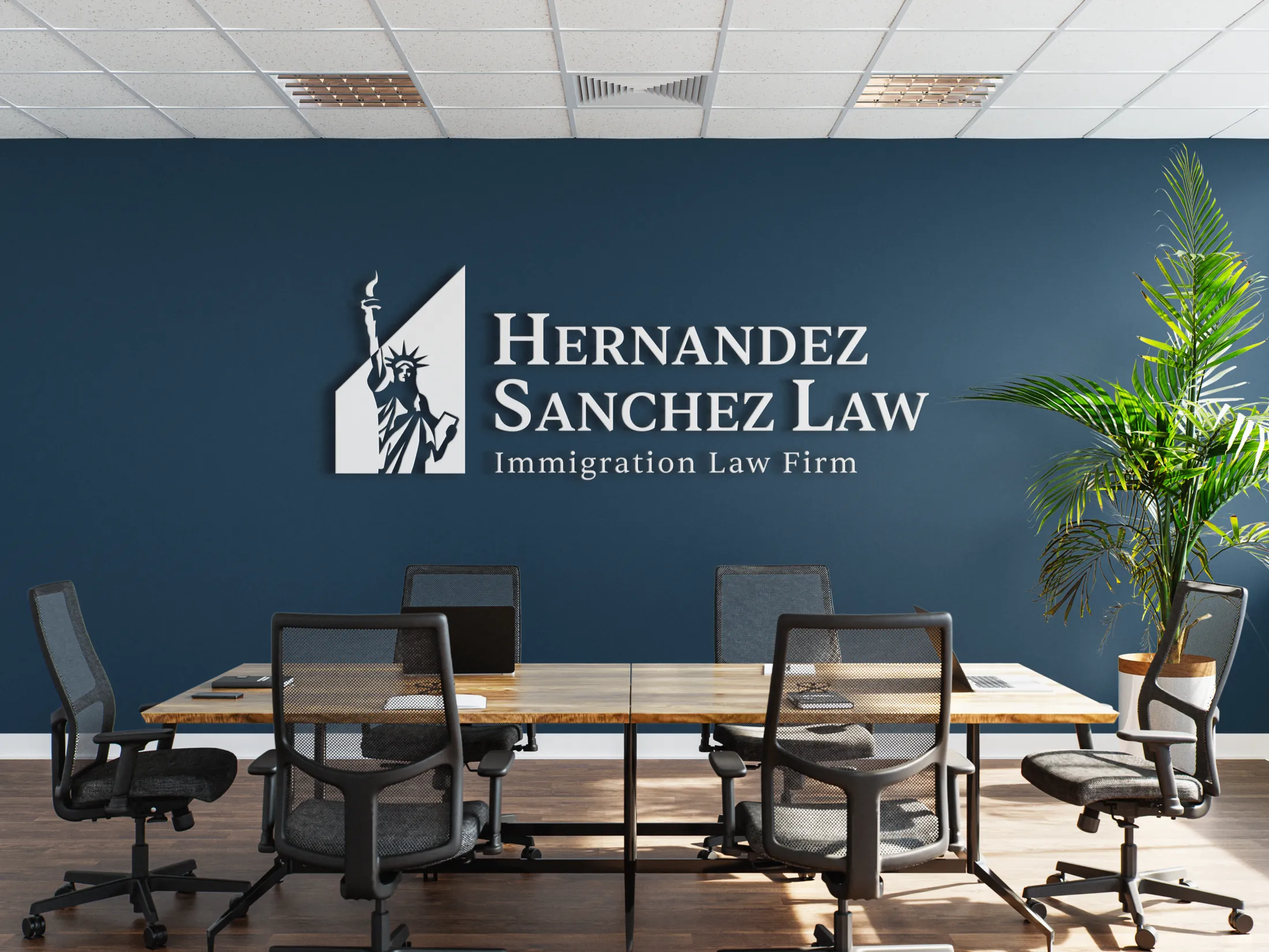
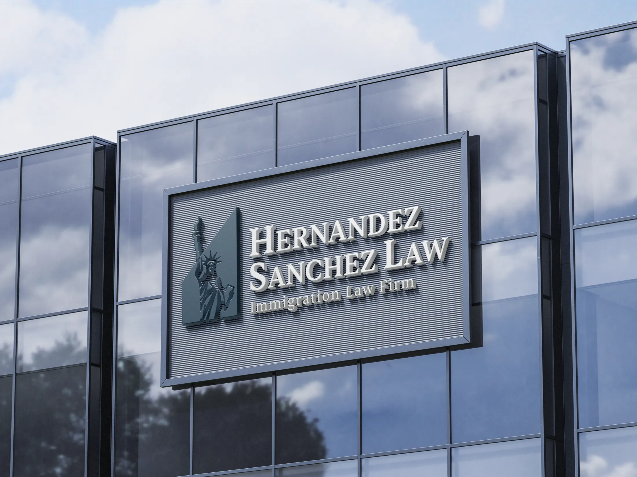
This was probably my biggest job yet. I was approached by a newly licensed lawyer, just passed the bar and was already in the process of launching his own immigration law firm: Hernandez Sanchez Law. He not only needed help getting a website for the firm up and running, but also needed a full brand identity from the ground up.
To get the ball rolling, I first began iterating logo drafts. This was my very first time conceptualizing and designing a logo for a law firm. Usually, my design process leans in a more abstract direction, but this time I had to bring it down to match the corporate aesthetics expected in the legal industry. It was a bit of a challenge at first — but I had a lot of fun.
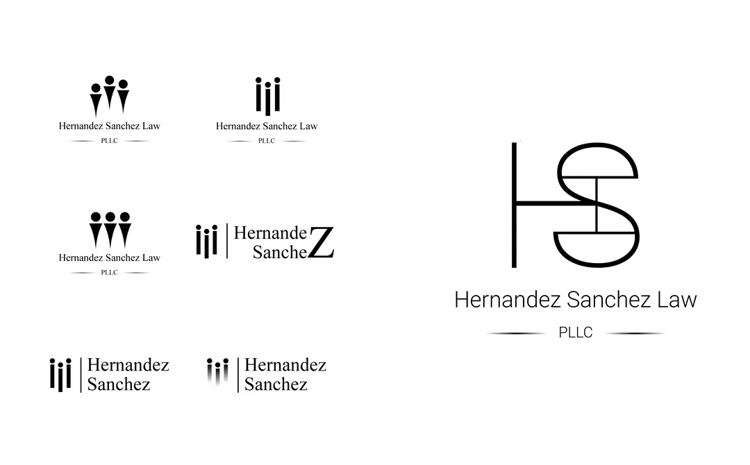
The client told me he wanted something well-designed and meaningful, while still being simple and easy to read. He wanted the fact that he is an immigration lawyer to be immediately recognizable in the branding. We decided to go with a simple logomark paired with a clean text-based logo. Attorney logos are often very similar — justice scales, columns, the Statue of Liberty, Lady Liberty, or an eagle tend to dominate. Alternatively, some go with monograms. Since these symbols have been heavily used, the challenge was to reimagine them in a way that didn’t feel too repetitive.
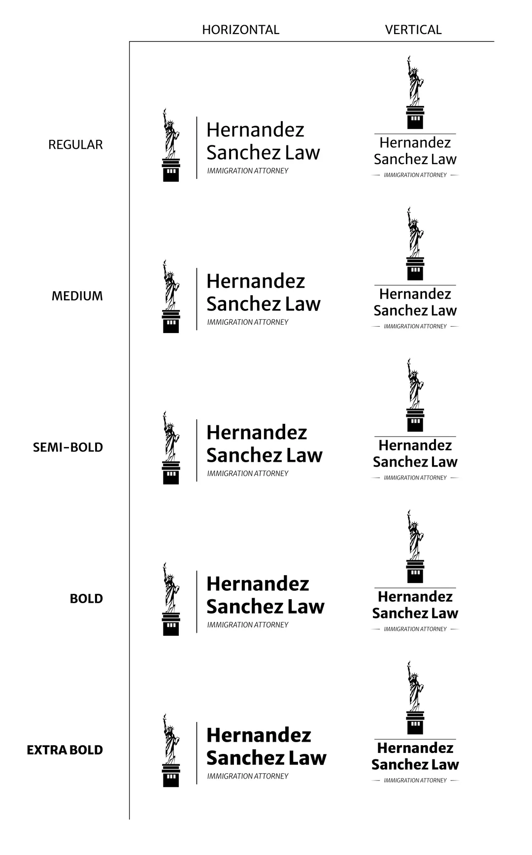
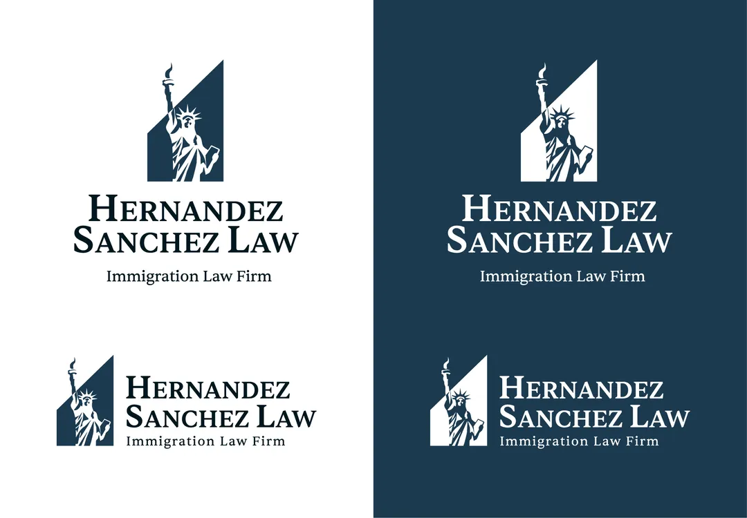
I began illustrating custom icons that could serve as potential logomarks. The client emphasized that he wanted the brand to reflect freedom. That’s when I created a custom Statue of Liberty icon, which became our foundation. I then had the idea to experiment with negative space — applying it to a vertical right trapezoid. I chose this shape because it begins with the visual weight of a square/rectangle (symbolizing stability, balance, and professionalism) and ends with the upward point of a triangle (symbolizing direction and progress). When combined with the negative of the Statue of Liberty, the final mark tells a story: “Hernandez Sanchez Law is dedicated to the established freedoms and due process of our immigrant communities, offering a solid foundation to help them move forward through our constitutional legal system — with a refreshed lens”.
To complement the mark, we chose Sentient for the logotype — a sophisticated serif with a modern edge. It hits the perfect tone: classic enough to convey trust, yet distinctive enough to feel current and confident.
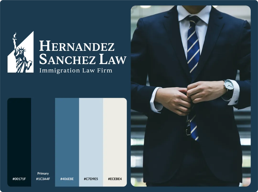
After finalizing the logo, we moved on to the color palette. The client requested a brand color in the blue-green range, which guided the rest of the palette development. I selected complementary colors that would support the primary tone while maintaining a sense of professionalism and trust.
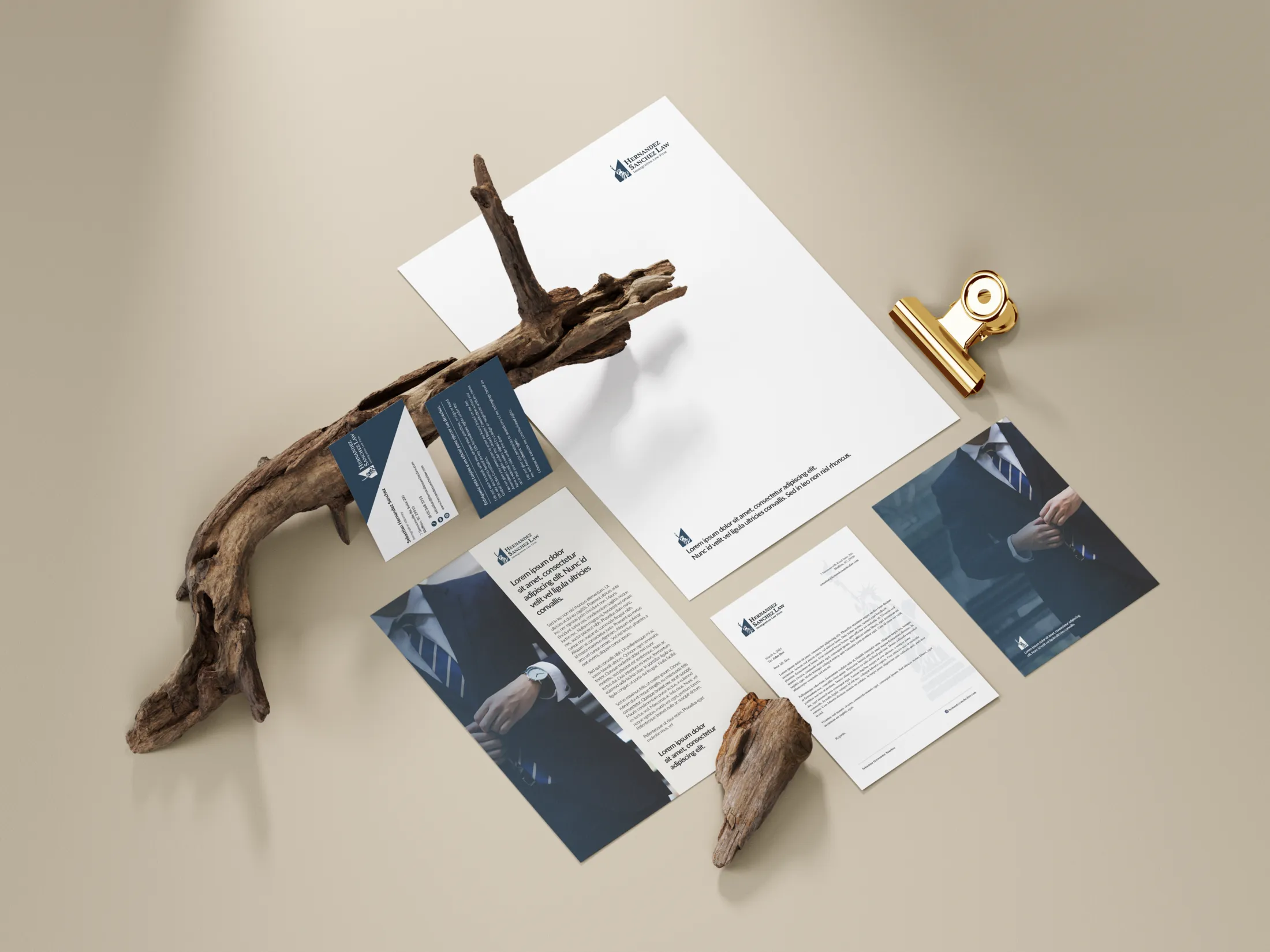
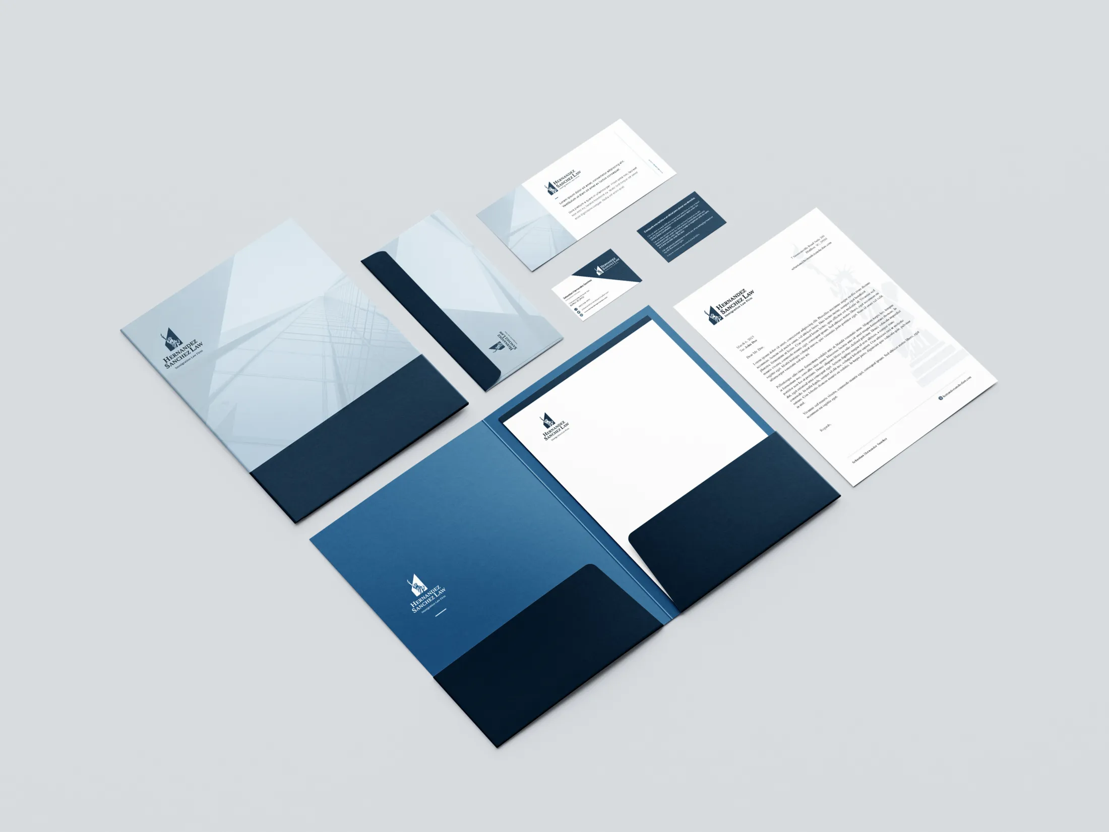
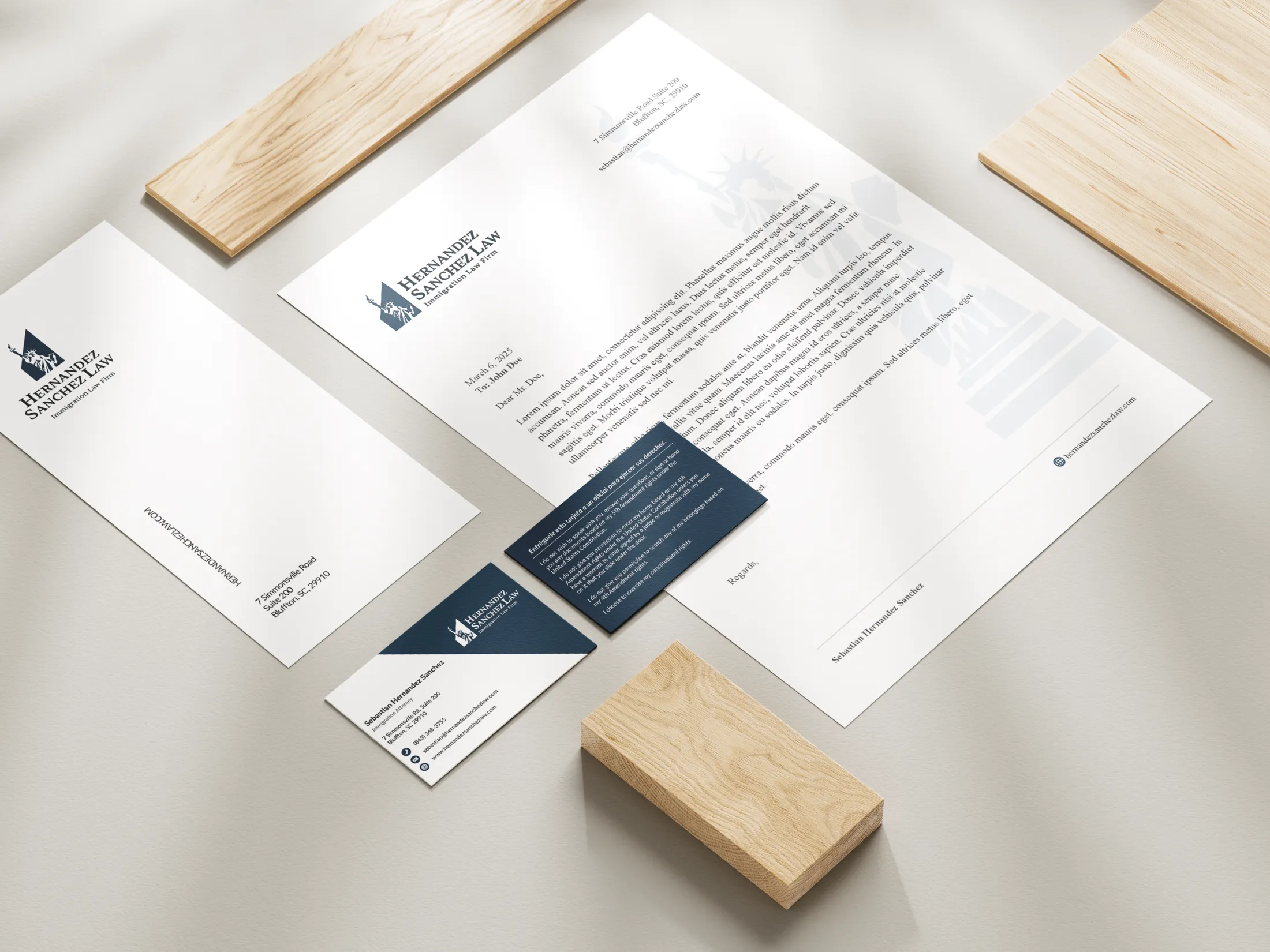
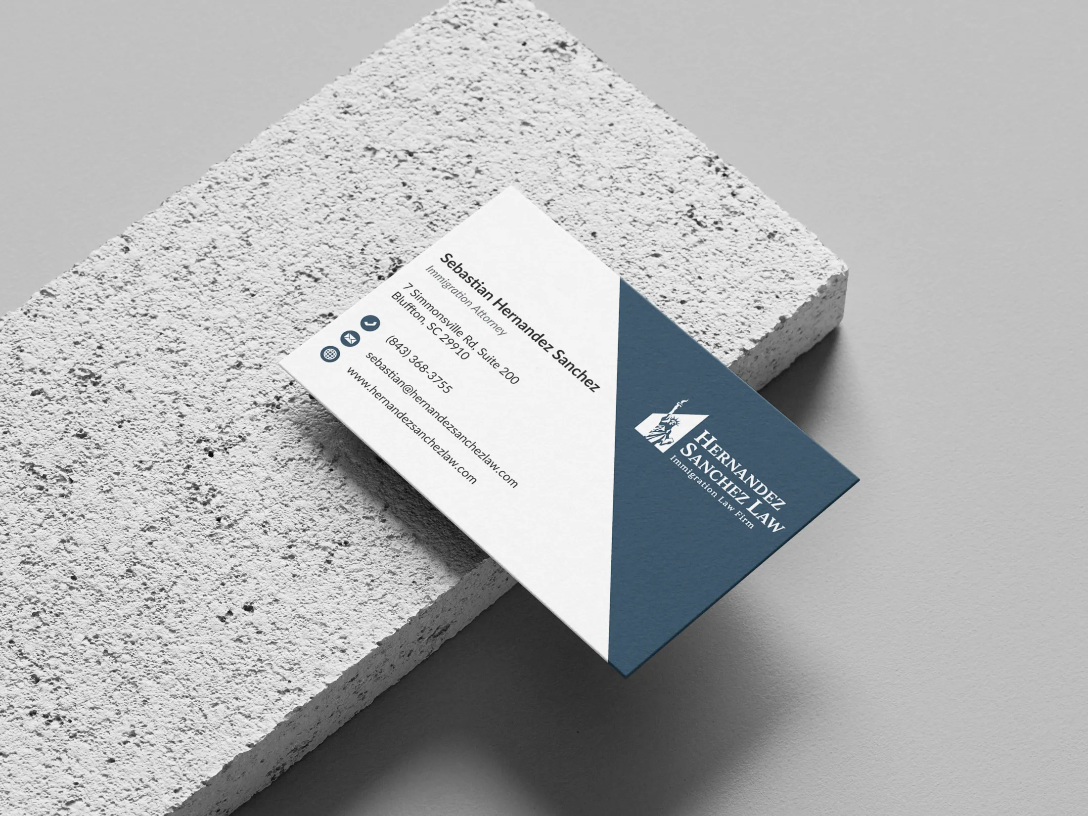
With the logo and colors locked in, designing the business card and letterhead felt like a natural next step. I explored several ideas, especially for the letterhead, to ensure the brand identity translated seamlessly across all mediums.
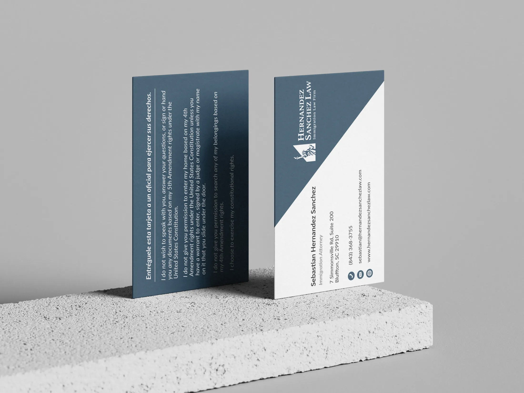
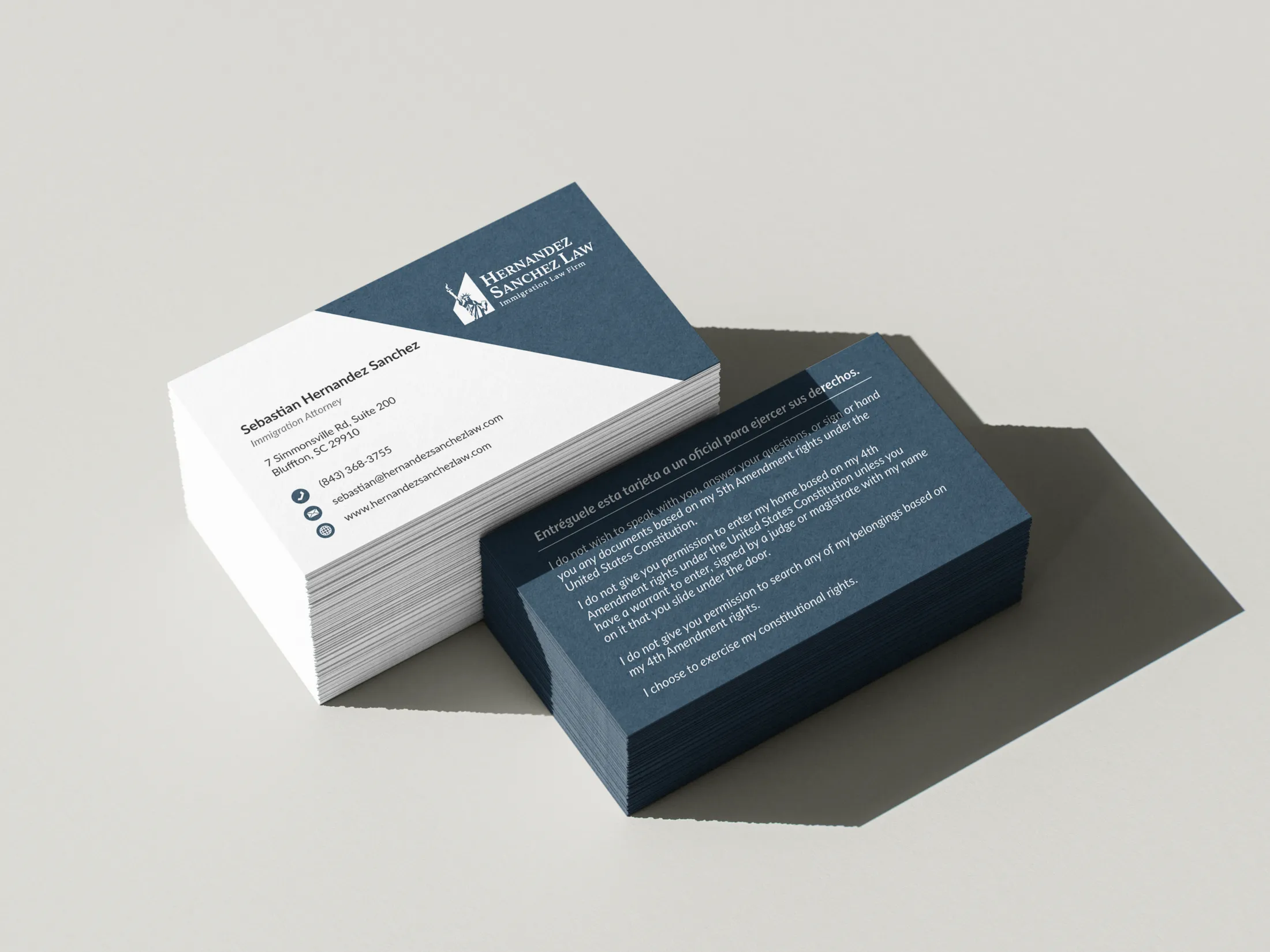
Designing the business card was a relatively quick and straightforward process. By this point, all the core branding decisions — logo, color palette, and typography — had already been made, which gave me a solid foundation to work from. The layout came together naturally, and I focused on keeping it clean, legible, and professional, ensuring it reflected the same polished tone we established across the rest of the brand.
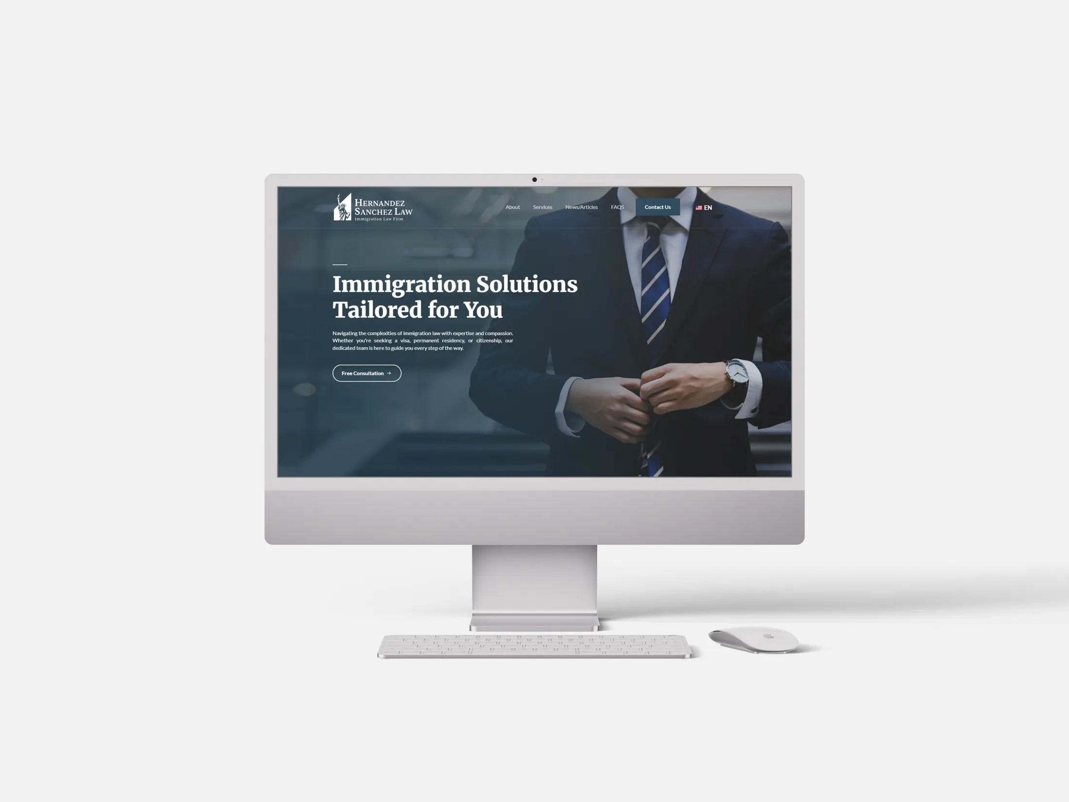
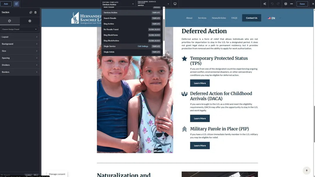
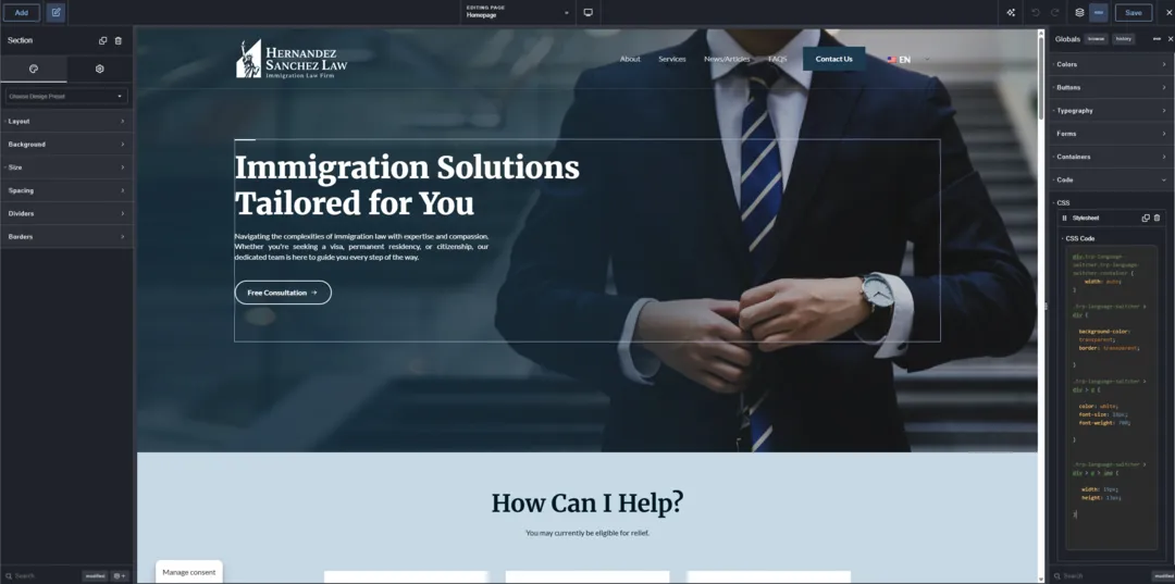
Once the branding and print assets were completed, it was time to bring everything together on the web. For the site build, I of course used WordPress alongside the Breakdance page builder — my go-to combo for creating fully custom, responsive designs. The biggest challenge at this stage was striking a balance between the traditional, corporate feel expected from a law firm and a more modern, refreshed design language. Most law firm websites in general feel like they haven’t changed since the early 2000s — cluttered layouts, outdated fonts, and uninspiring visuals. I wanted Hernandez Sanchez Law to stand out as modern, clean, and credible — without being too cold or generic.
Given the nature of the firm’s work and audience, the client also emphasized security and accessibility. It was important that users felt safe submitting their information through the site and that the experience was inclusive. I paid close attention to color contrast, type size, and keyboard navigation to ensure the site was usable by all visitors.
Security was a major priority throughout the build of the Hernandez Sanchez Law website, especially given the sensitive nature of the firm’s client interactions. Beyond choosing a reliable hosting provider with strong baseline protections, I implemented a comprehensive security stack. This included installing a reputable security plugin to monitor for hackers and malware threats, enabling SSL and HTTPS site-wide, and configuring Turnstile CAPTCHA on all contact forms to block bots and spam (on top of baseline spam protection). I also set up SMTP for secure and authenticated email delivery, reducing the chance of messages being flagged as spam. To further harden the site, I enabled CDN-level brute force protection and optimized form settings to prevent injection or misuse. These layers work together to help ensure the site runs safely, reliably, and professionally — giving both the firm and its clients peace of mind.
To support the overall tone, we selected Merriweather for headings — a serif font that conveys professionalism and reliability — and Lato for body text to keep things clean and highly readable. The mix reinforces that careful balance between traditional and modern.

One of the most technical parts of the project was transferring the firm’s domain from Squarespace to its current hosting service — a first for me. And to make things even more complex the domain already had an active business email account that was in use daily for client communications. I had to ensure the transition happened seamlessly, with zero email downtime. This meant coordinating DNS changes, properly configuring MX records, and confirming mail routing was uninterrupted — which thankfully, it was.
The site also needed to be bilingual in English and Spanish. This was my first time working with a translation plugin — I used TranslatePress to configure and manage the multilingual setup. It took some trial and error, but I made sure every page, button, menu, and section translated cleanly between both languages.
Finally, I worked with the content provided by the client to determine the best layout structure. Each page was thoughtfully designed to guide visitors through the firm’s values and services, with strategic CTAs that invite connection and build trust.
Overall, this project was incredibly rewarding from start to finish. It pushed me creatively and technically — from developing a complete brand identity for Hernandez Sanchez Law, to managing a smooth domain migration, to building a bilingual website that breaks away from the outdated mold of most law firm sites. I’m especially proud of how everything came together to reflect the firm’s mission and values. It was an honor to support an up-and-coming immigration law firm doing such important work, and I’m genuinely excited to have played a role in helping launch something with real impact. I’m also happy to continue working with Hernandez Sanchez Law on an ongoing basis — the firm has kept me on retainer to maintain and update their website, ensuring it stays secure, accessible, and current as they grow.